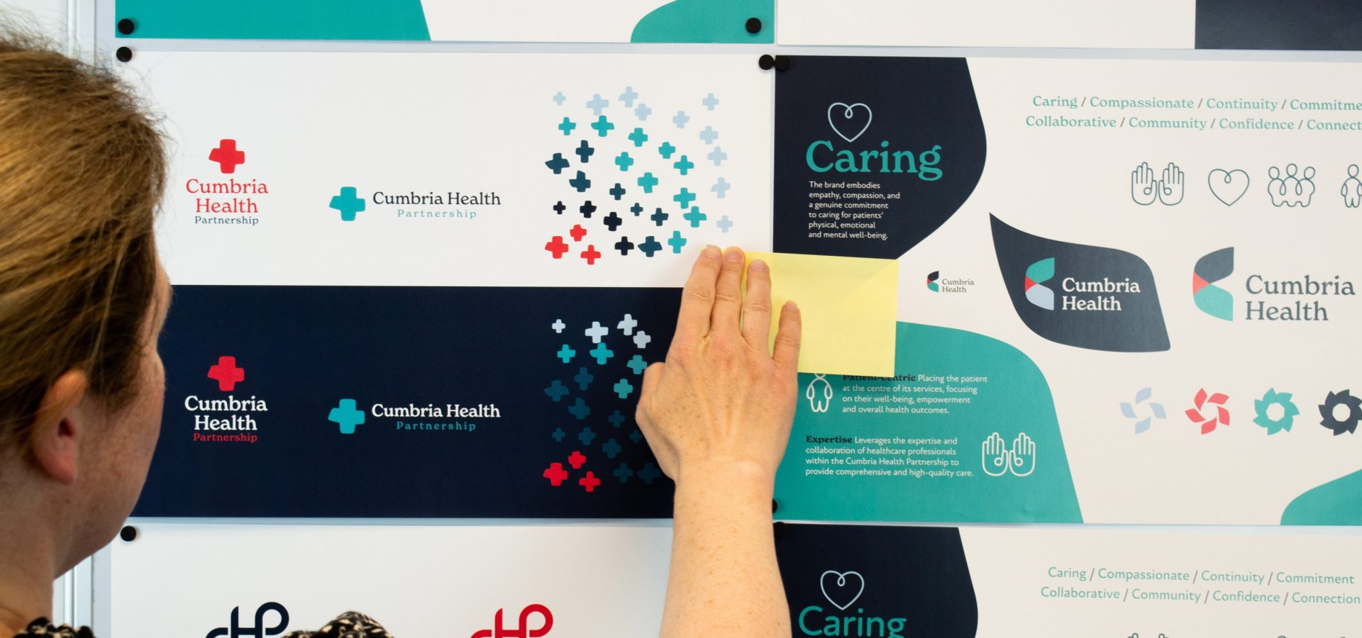
Through stakeholder sessions and collaborative workshops, we worked closely with key figures within Cumbria Health, whom brought a unique perspective that enriched the rebranding process. Their input was instrumental in shaping a brand that feels both authentic and innovative. These sessions gave us a holistic understanding of the organisational culture and a clear sense of the compassion that defines Cumbria Health, guiding us as we built an identity that was not only visually appealing but deeply aligned with the ethos of care, accessibility, and continuous improvement. Through this collaboration, we ensured that the new brand identity would resonate with both the internal team and the broader community, creating a cohesive, welcoming experience at every touchpoint.

Cumbria Health Rebrand
When Cumbria Health approached us with the goal of a rebrand, the mission was clear: create an identity that mirrors its progressive, community-centric approach while preserving the strong foundation of trust it has built over years of dedicated service. The existing branding was functional yet lacked the warmth, clarity, and modern appeal essential to an organisation poised to lead in today’s evolving healthcare landscape.

Understanding Cumbria Health’s Heartbeat

Crafting a Visual Language of Care
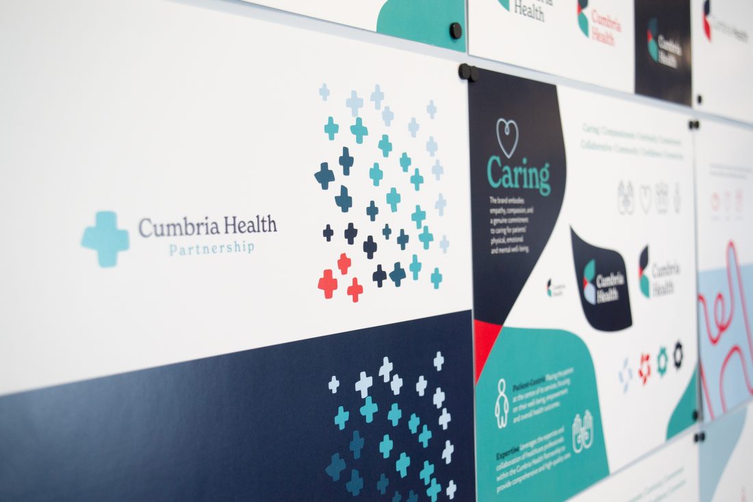
Our approach to Cumbria Health’s new identity involved creating a visual language that was not only distinct but also deeply relatable. We introduced a colour palette that exudes calm and clarity, a mix of cool, welcoming blues and gentle greens. The choice of typeface, rounded and approachable yet professional, complements the brand’s dedication to accessibility and innovation. Through custom icons and a more human-centered layout, we wanted each element to reflect the values of inclusivity and warmth without sacrificing clarity.
To add a modern twist, we incorporated animated elements throughout Cumbria Health’s digital platforms. These animations serve as gentle guides, drawing users through their online journey in an interactive way that feels friendly and informative. The animations provide moments of engagement that break down the barriers of traditional healthcare communication, making healthcare information feel both accessible and empowering. Whether it’s a friendly icon pointing towards appointment information or a visual cue guiding users through healthcare resources, these animated touches help Cumbria Health connect more effectively with its audience.


Embracing Innovation While Rooted in Tradition
Our work with Cumbria Health wasn’t just about a fresh coat of paint; it was about building a brand that would stand the test of time while adapting to the future needs of healthcare. We collaborated closely with Cumbria Health to ensure that the new brand reflects the organisation’s commitment to providing innovative, accessible care in ways that feel authentic to the people of Cumbria. Every aspect of the rebrand, from logo design to tagline, was meticulously crafted to evoke a sense of trust and a forward-thinking outlook, positioning Cumbria Health as a healthcare leader that prioritises both tradition and modernity.
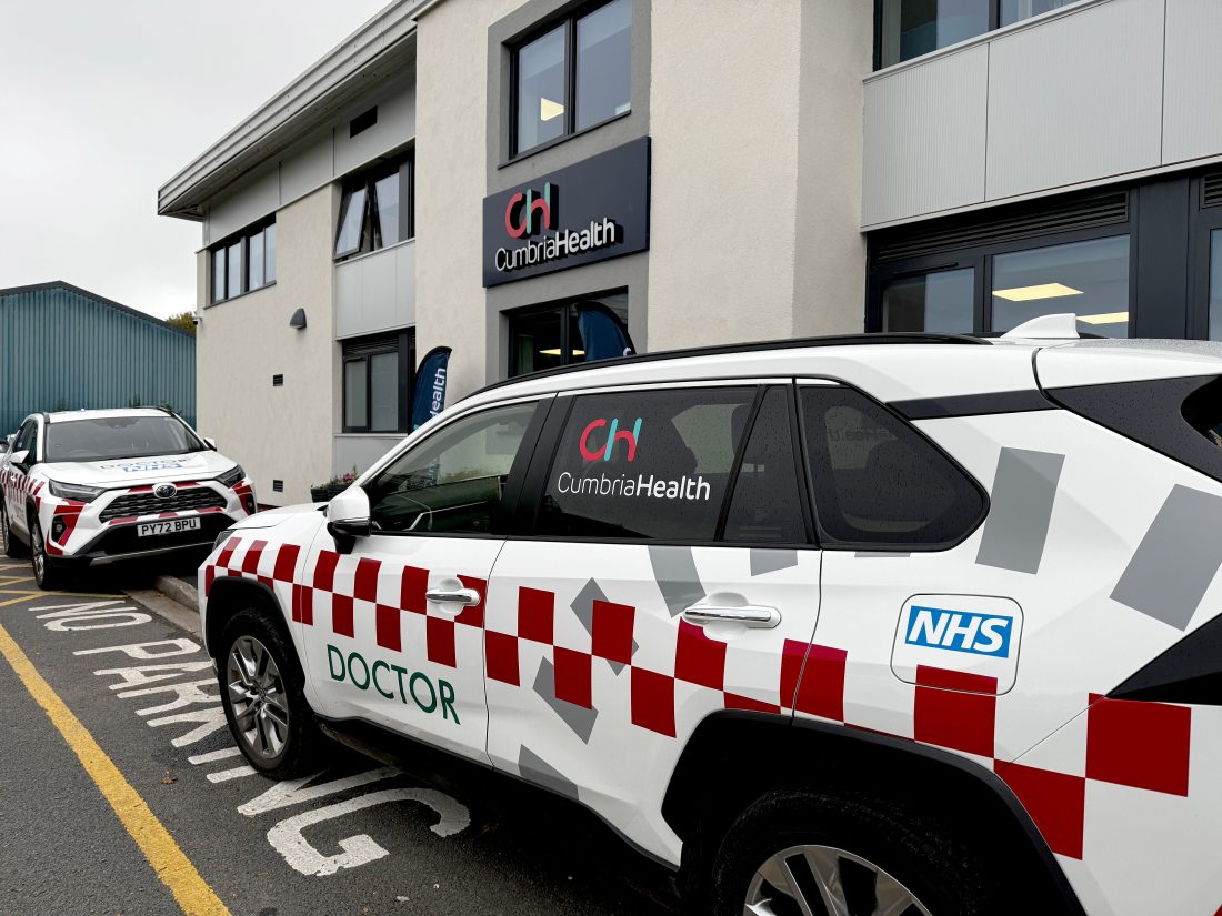
The result? A refreshed identity that embodies Cumbria Health’s values of care, trust, and community. The new look reinforces the organisation’s mission to make healthcare accessible, compassionate, and inclusive. With this brand evolution, Cumbria Health can step confidently into the future, equipped with a visual and digital presence that resonates with its community and enhances the connection between provider and patient.
