The team at Cumbria Health knew that their website was not performing well or serving their audiences in the way it should be. As a key part of healthcare in the community, the organisation knew it needed a presence that its audiences could access, understand, and use with ease - a big part of our work was to remove existing barriers and revamp the site in order to meet these requirements.
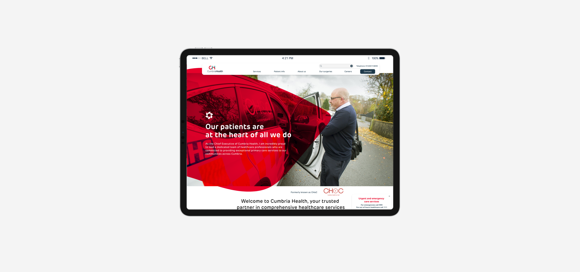
New Website For Cumbria Health: Bringing Accessibility & Care To Life
Thoughtful design and smart accessibility features were the core components of the website design that we created for Cumbria Health; find out more about how we used this project to make healthcare information accessible and engaging for everyone.
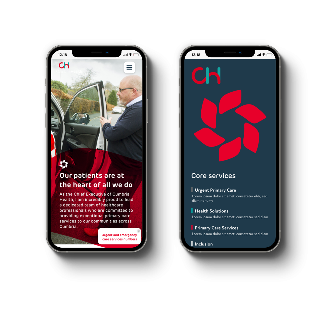
Project objectives
What we did
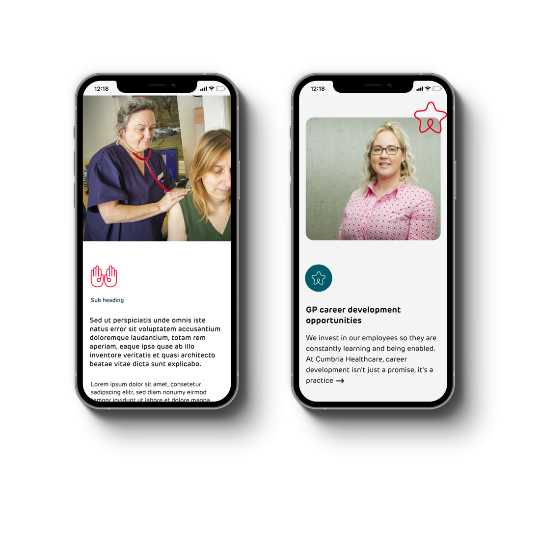
UX Research
Our research process included workshops with key stakeholders, including Susan Blakemore, Diana Banks, and Charlotte Myers, with each bringing insights into the organisation’s needs. Their input helped us to prioritise website functionality for patient resources, and ease of access was part of this. They told us more about their vision for digital growth - and how essential it was for their new presence to communicate a clear forward-looking approach that aligns with industry standards.
By combining these perspectives with feedback from Cumbria Health’s internal teams, we gained a 360-degree view of the website’s critical roles in patient engagement, resource navigation, and organisational support.

Prioritising accessibility and user experience
The aim of our UX design process was simplifying user journey to make healthcare information accessible to everyone, from first-time visitors to regular users.
Revising the navigation menu
We started by developing wireframes that focused on intuitive navigation, minimising the number of steps required to access essential services. Every aspect of the layout was crafted to guide users through the site naturally, providing a seamless experience even for those with different levels of digital literacy.
Ensuring compliance with accessibility standards
Accessibility standards were central to our design approach, ensuring compliance with WCAG guidelines for visual contrast, keyboard navigation, and screen reader support. We also incorporated elements like resizable text and clear, concise language to ensure that users of all abilities could easily interact with the website.
CMS upgrade for flexibility and future growth
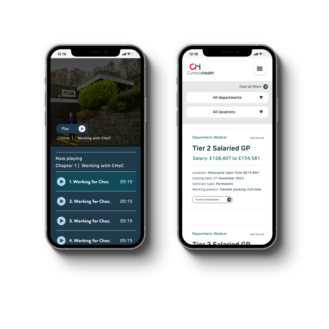
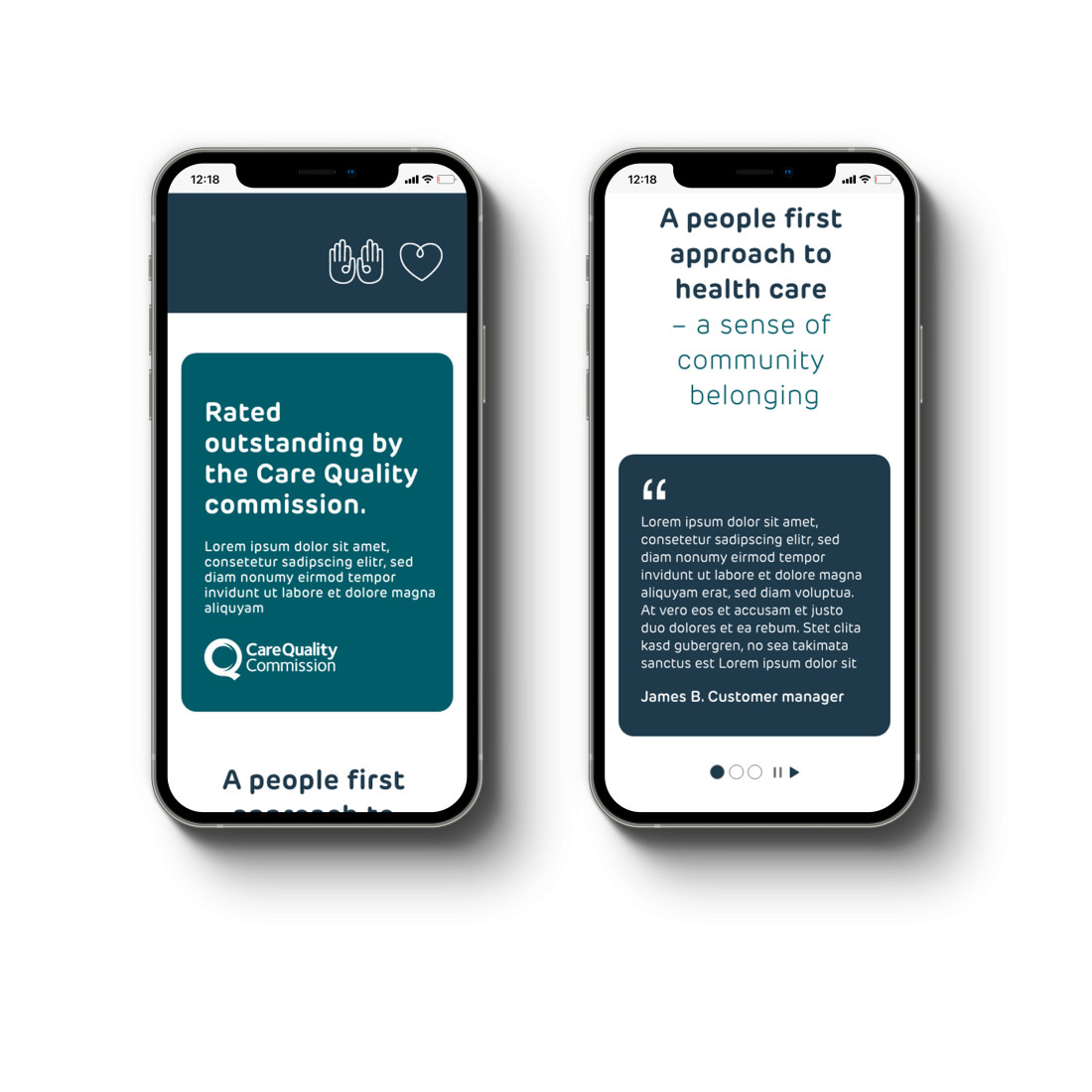
Built on Craft CMS, the new website allows Cumbria Health to update content with ease. Craft CMS was chosen for its flexibility, security, and robust performance on all devices, ensuring an optimised experience whether users access the site on mobile or desktop.
Adding engaging and functional features
One of the website’s standout features is the integration of the NHS Careers API, which allows Cumbria Health to dynamically display updated job listings directly on the site. This functionality makes it easy for potential candidates to browse opportunities without navigating away, positioning Cumbria Health as an accessible entry point for careers in healthcare.
We also used custom animations and Lottie files to introduce dynamic visual cues without compromising page speed or accessibility. These animations enhance the user experience, making it engaging while supporting efficient navigation.
What we achieved: The project outcome
Our work has provided Cumbria Health with a site that embodies accessibility, community connection, and modern healthcare standards. The new presence empowers users to confidently explore services, resources, and opportunities with ease.
Our website development and UX design support throughout the project now positions Cumbria Health as a digital leader, with a modern platform that simplifies access to healthcare for all audiences.
Interested in working with us?
From UX research to website design, we craft platforms that make complexity feel simple.
Talk to us about how we can help you to make your website work harder, and serve your audience better.


