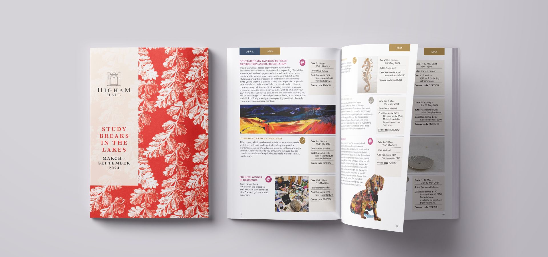
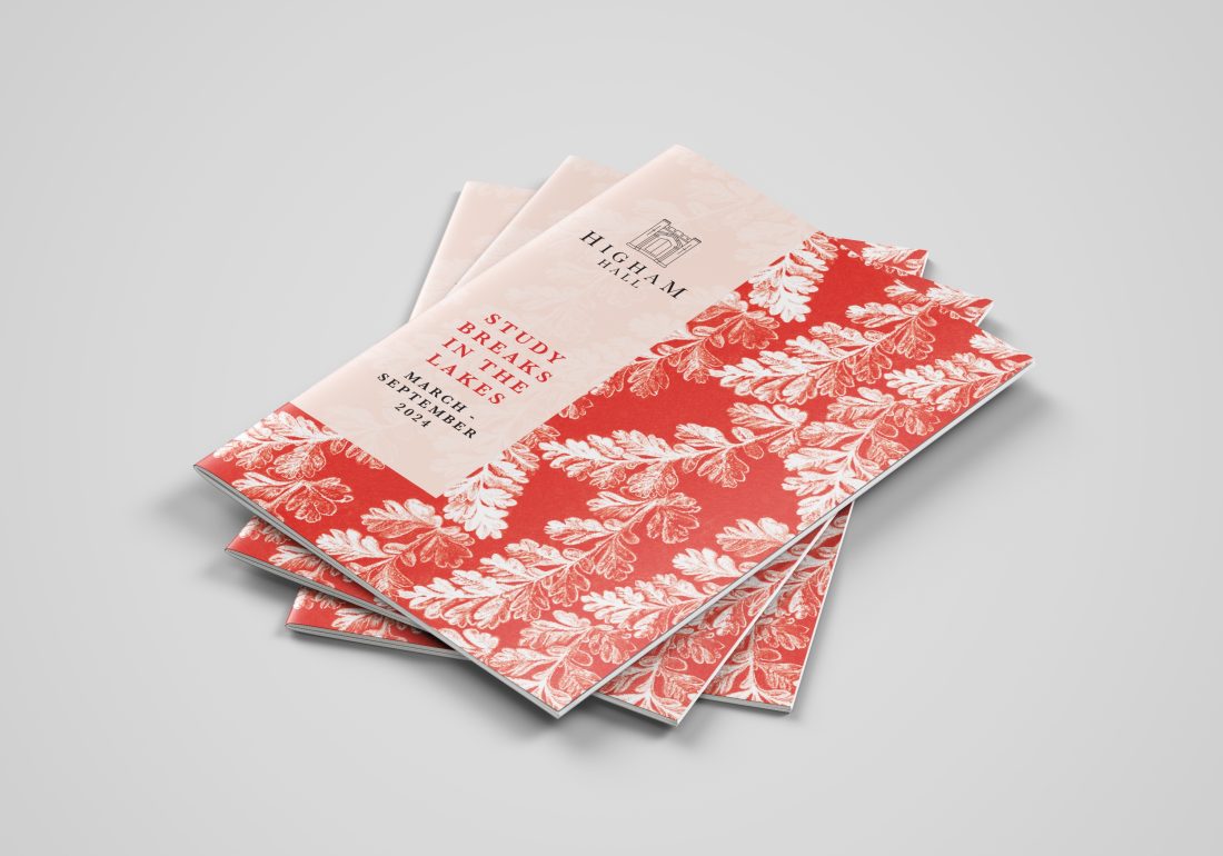
During discussions with the client, we highlighted the need to clarify their existing brand identity before redesigning the popular Higham Hall course brochure.
Our first step was to evaluate how Higham Hall's current brand resonated with its identity as an establishment, its architecture, and its location. Through visits, discussions, and brainstorming sessions we acquired an understanding of the necessary changes. We devised strategies to propel their brand forward, encompassing various platforms such as print, digital, social media, and on-site presence.
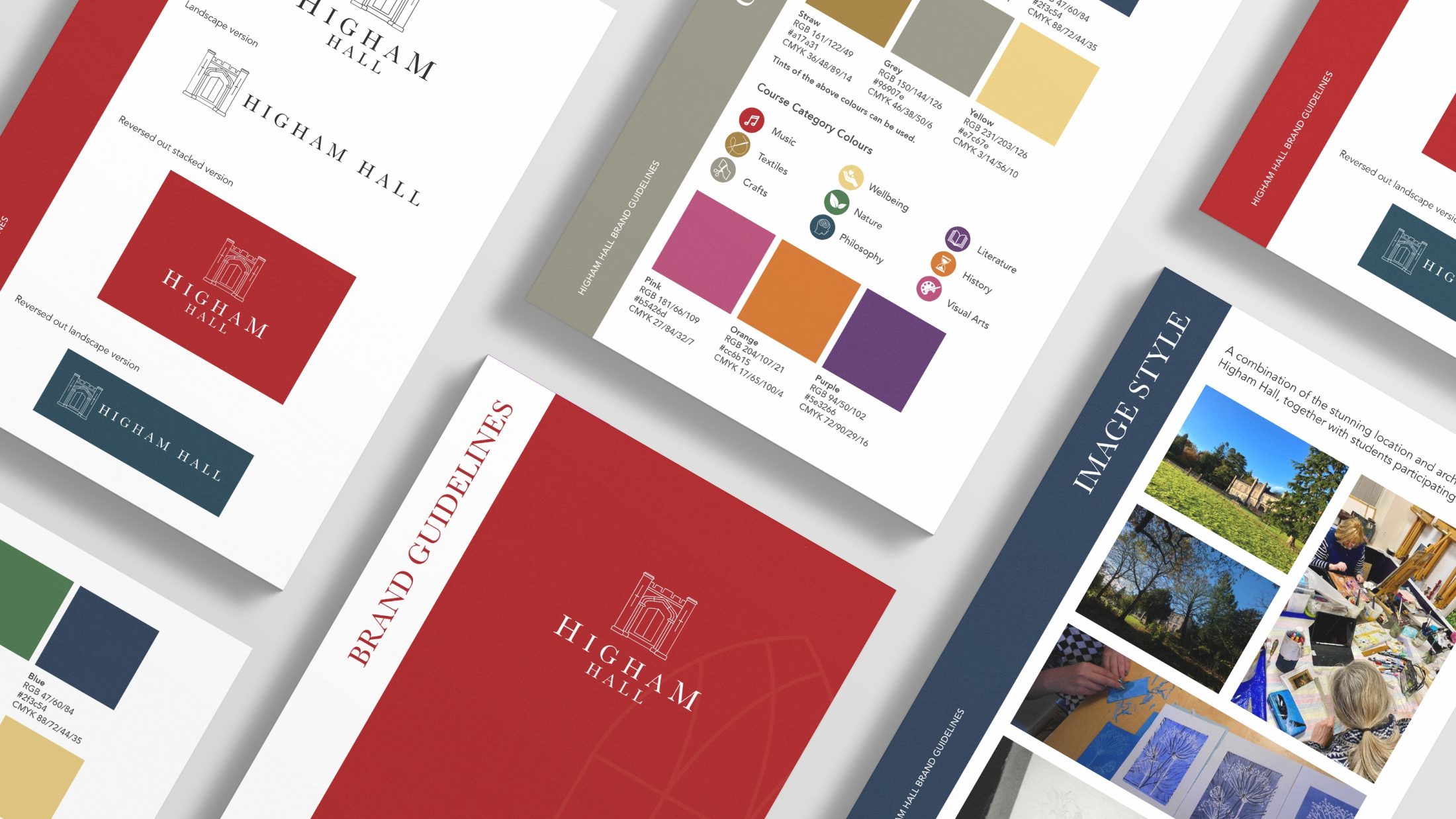
From the beautiful Gothic architecture of Higham Hall, we found great inspiration. Starting with the logo, we created a simple graphic illustration of the front doors of the Hall, balanced with the use of Baskerville, a traditional serif font. To complement Baskerville, which is used as the accent font for headings and similar elements, we paired it with a simple sans serif font, Avenir, for body text.
This simplistic and illustrative approach extended to the creation of graphic assets, inspired by the intricate details found within the Hall. These can be used to add interesting elements to designs, but also to reflect the feel and history of Higham Hall.
Rich, heritage colours were used to create a colour palette with the history of Higham in mind.
