10 Creative Website Experiences to Spark Your Next Web Design in 2025
When it comes to creative web design, striking the right balance between flair and functionality can feel like walking a tightrope. On one hand, you want your website to be memorable, unique, and full of personality. On the other, sticking to certain design patterns ensures your layout is intuitive and easy to navigate.
But great interactive web interfaces don’t just look beautiful — they tell stories and create memorable experiences. The key is finding the sweet spot: a website that’s visually engaging while still user-friendly and functional.
So, what makes a creative web layout that strikes this balance? Let’s break down the key elements — and then showcase 10 standout websites in 2025 that nail the execution.
The Anatomy of a Standout Creative Web Layout
Expressive Typography
Gone are the days when typography played it safe. In 2025, fonts speak. Designers are using bold, editorial headlines, kinetic type, and expressive typefaces to inject personality into digital spaces.
Why it matters: Type is often the first thing a user sees — make it part of the brand experience.
Thoughtful Scrollytelling
Scrollytelling transforms a static page into an unfolding narrative. It guides users with visual pacing — through animation, parallax layers, and progressive content reveals. When done well, it feels like reading a beautifully designed magazine that moves with you.
Why it matters: Keeps users engaged by presenting content in a digestible, story-first way.
Inclusive, Accessible Design
Design that excludes anyone isn’t truly creative. The best sites today — and certainly those shaped by the upcoming EU Web Accessibility Directive updates — put inclusiveness front and centre. That means high colour contrast, keyboard-friendly navigation, screen reader compatibility, thoughtful motion use, and semantic HTML. But more than that, it means designing with empathy.
Why it matters: Accessible design isn’t just a legal requirement — it’s the foundation of thoughtful, future-facing creativity. It ensures everyone can experience your story, not just those with perfect vision, hearing, dexterity, or cognition.
Subtle Animations
Motion adds life to a layout. Think hover reveals, ambient movement, and transitional effects that give feedback as users navigate. The trick is in subtlety — animations should enhance, not distract.
Why it matters: Encourages exploration and adds delight without overwhelming.
Unique Interactions
From draggable timelines to immersive product reveals, clever interactivity gives users a reason to play with your site. It turns passive scrolls into meaningful actions.
Why it matters: Makes the user part of the experience — not just a spectator.
Progressive Content Reveal
Staggered loading, timed transitions, and context-aware reveals (like showing content based on user scroll or hover) help direct attention without dumping everything on the user at once. It gives a sense of pacing that feels natural.
Why it matters: Keeps content feeling fresh and layered — which helps guide the user journey without overwhelming.

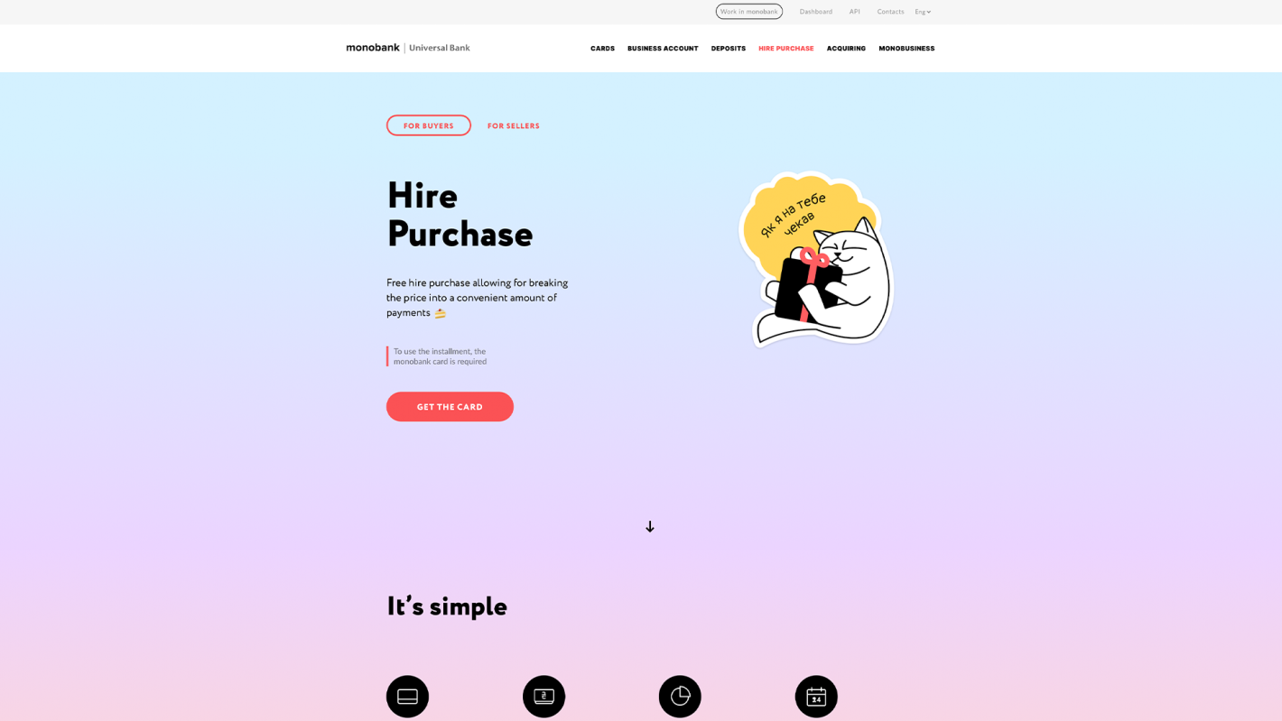
1. Monobank (Fintech)
Why it stands out: This Ukrainian digital bank uses slick microinteractions, a confident dark mode design, and playful illustrations that feel alive without being chaotic. It pairs motion with clarity — especially on mobile.
Creative elements: Unique interactions, subtle animations
Accessibility notes: Clean type contrast and intuitive layouts work well for visual clarity.

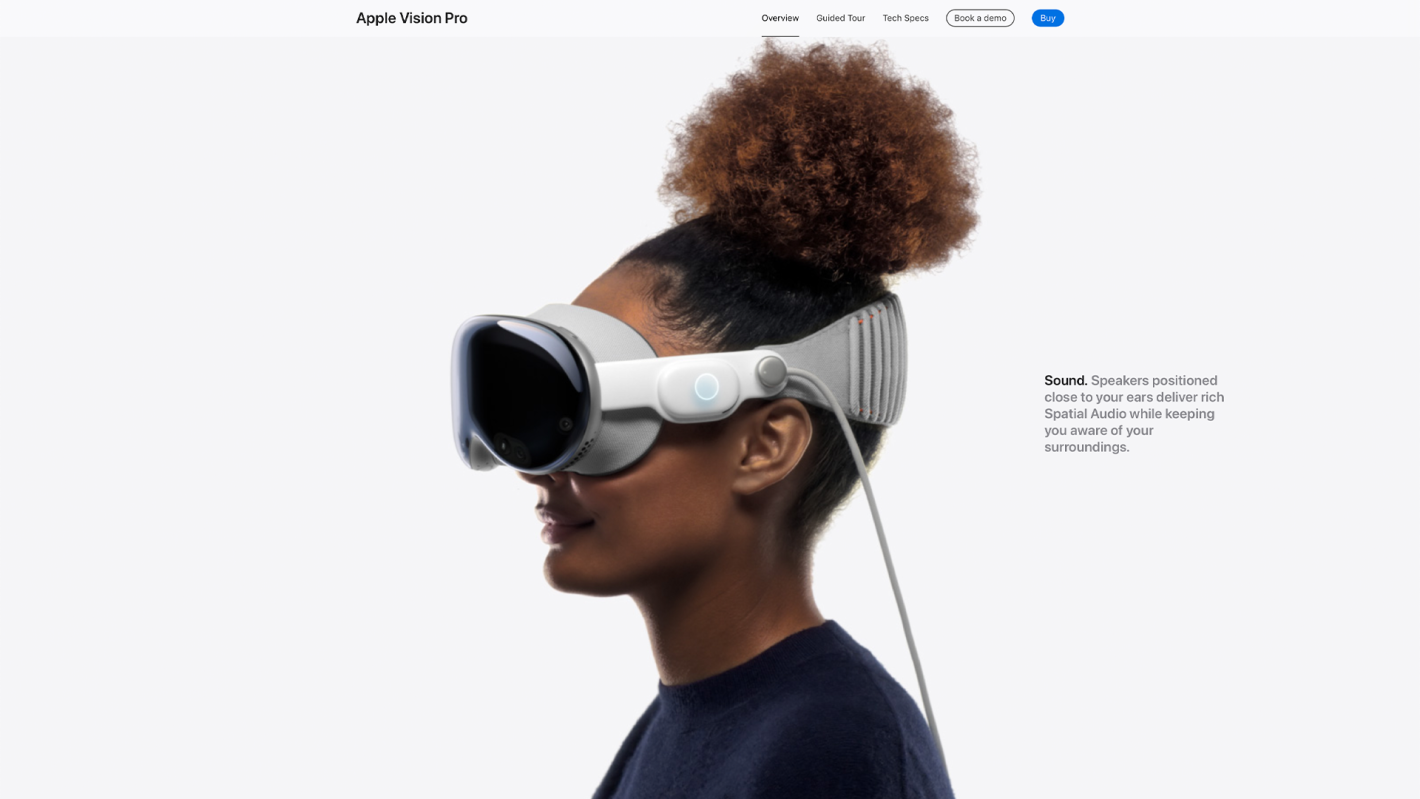
2. Apple Vision Pro (Tech Product)
Why it stands out: Every scroll is intentional. This site is packed with real-world immersion — 3D product rotations, ambient audio, and experiential demos. But it’s also a masterclass in accessibility, especially through text scaling and motion control settings.
Creative elements: Real-world immersion, thoughtful scrollytelling
Accessibility notes: Designed for diverse audiences, supports reduced motion preferences and readable contrast.

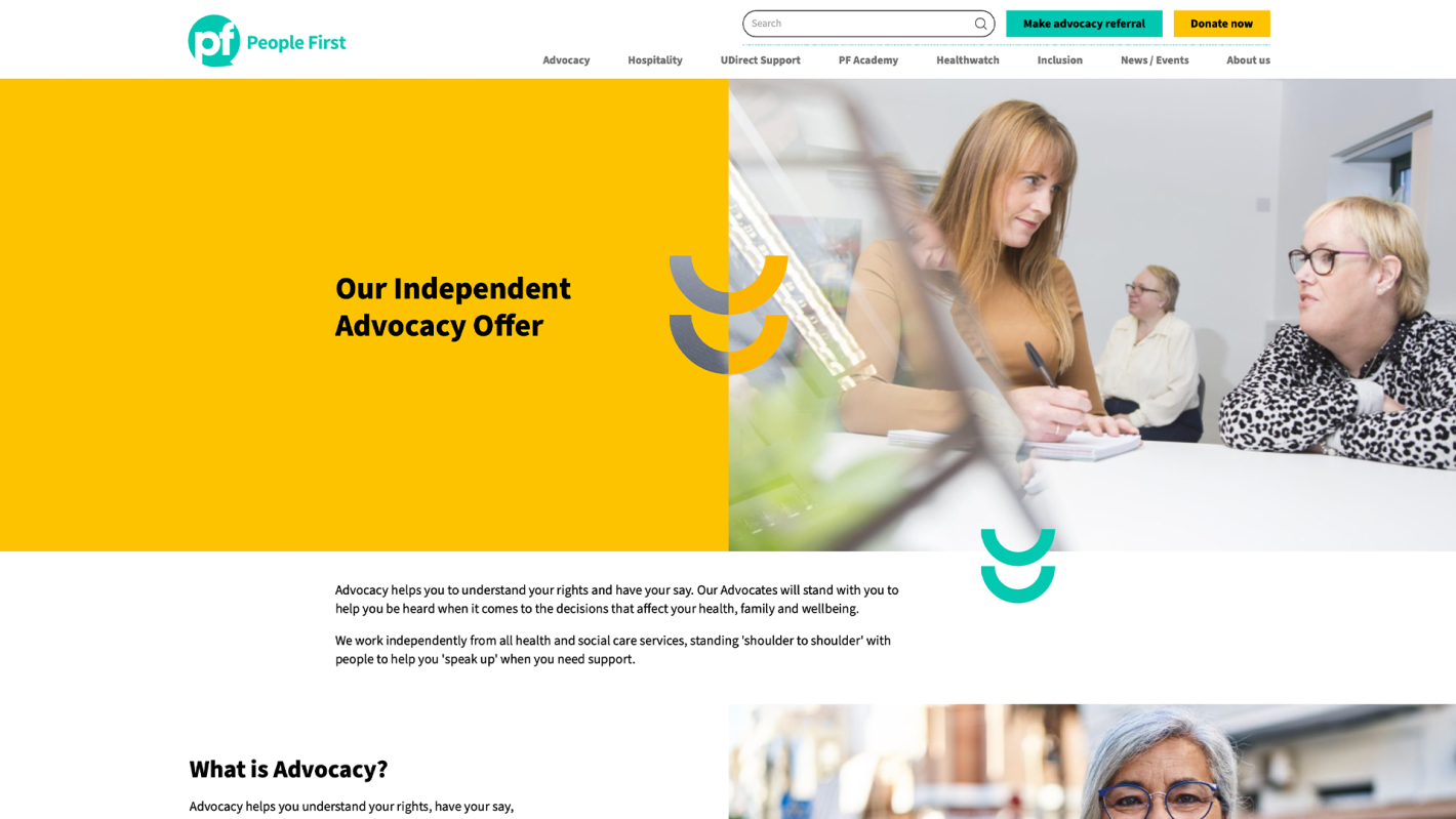
3. We Are People First (Accessibility & Inclusion Consultancy)
Why it stands out: A design-first approach to inclusivity. The experience is warm, human, and intentionally easy to navigate — built around the idea of clarity and respect for all users.
Creative elements: Expressive typography, inclusive design
Accessibility notes: WCAG 2.1 AA compliance is clearly visible — it’s thoughtful, not performative.

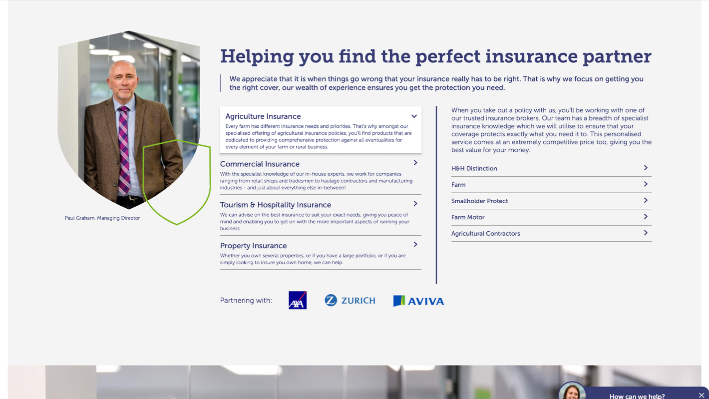
4. H&H Insurance Brokers (Insurance / Rural Services)
Why it stands out: Who says insurance needs to be boring? The H&H site feels grounded and welcoming, with crisp typography, subtle movement, and a modern layout that suits both B2B and B2C audiences.
Creative elements: Progressive content reveal, structured scrollytelling
Accessibility notes: Straightforward navigation and minimal distractions make it usable for a wide audience.

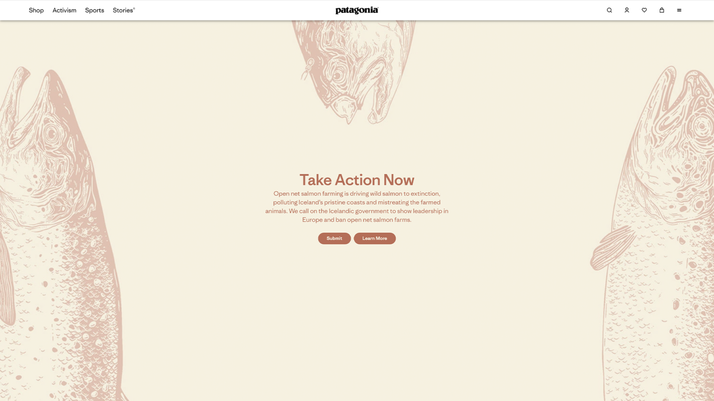
5. Patagonia (Sustainable Outdoor Clothing)
Why it stands out: Every interaction aligns with their brand ethos. From photo storytelling to immersive cause-led microsites, the layout is clean, visual, and rooted in authenticity.
Creative elements: Thoughtful scrollytelling, emotional design
Accessibility notes: Accessible product cards, logical hierarchy, and alternative text throughout.

6. NHS 111 Online (Public Sector / Healthcare)
Why it stands out: Not traditionally “creative,” but its design is a testament to clarity under pressure. The interface is user-first, emotionally aware, and built for all reading levels.
Creative elements: Simplicity, intuitive UX as design language
Accessibility notes: Built around GOV.UK accessibility standards with high-contrast options and keyboard navigation.

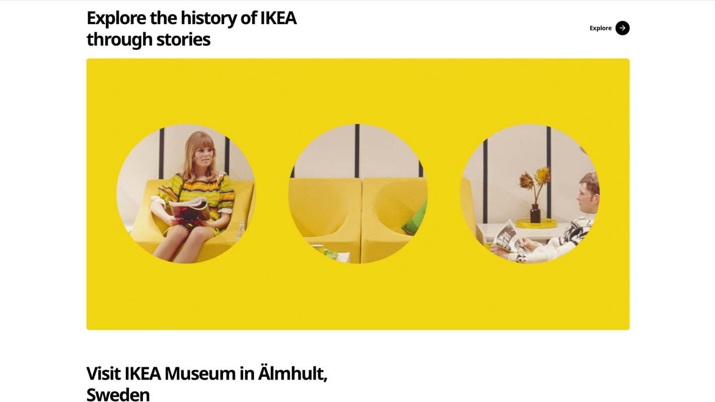
7. IKEA Museum (Cultural / Archive Website)
Why it stands out: A storytelling site that explores the history of IKEA with humour and warmth. The use of bold visuals and narrative structure creates a rich user journey.
Creative elements: Scrollytelling, visual storytelling
Accessibility notes: Font sizing, structure and nav patterns feel screen-reader friendly and universally accessible.

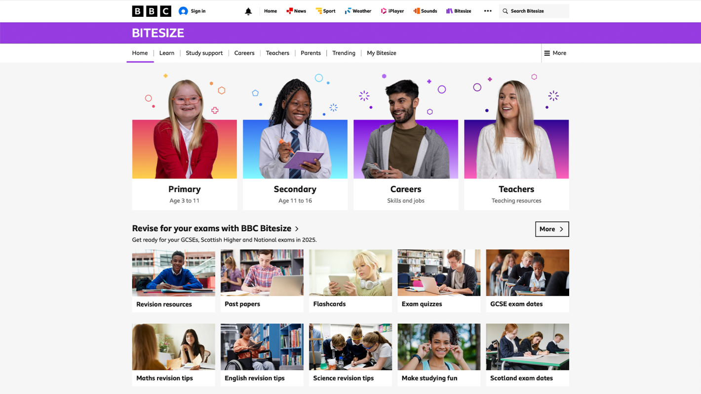
8. BBC Bitesize (Education)
Why it stands out: Fun, energetic, and structured for diverse learners. The site uses animation sparingly to guide users, paired with clear headers and a modular content layout.
Creative elements: Layered learning journeys, progressive reveal
Accessibility notes: Follows BBC’s in-house accessibility framework — very inclusive.

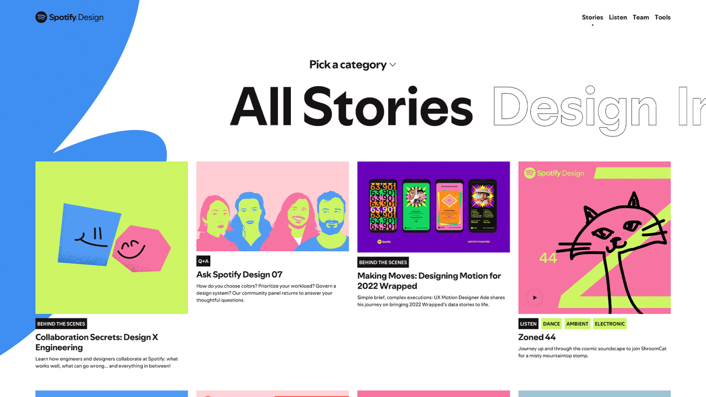
9. Spotify Design (Internal Brand Platform)
Why it stands out: While technically an internal brand site, Spotify Design deserves a mention for its combination of editorial clarity, expressive layout, and thoughtful accessibility tooling.
Creative elements: Expressive typography, interactive stories
Accessibility notes: Designed to educate designers on accessibility principles, so it leads by example.

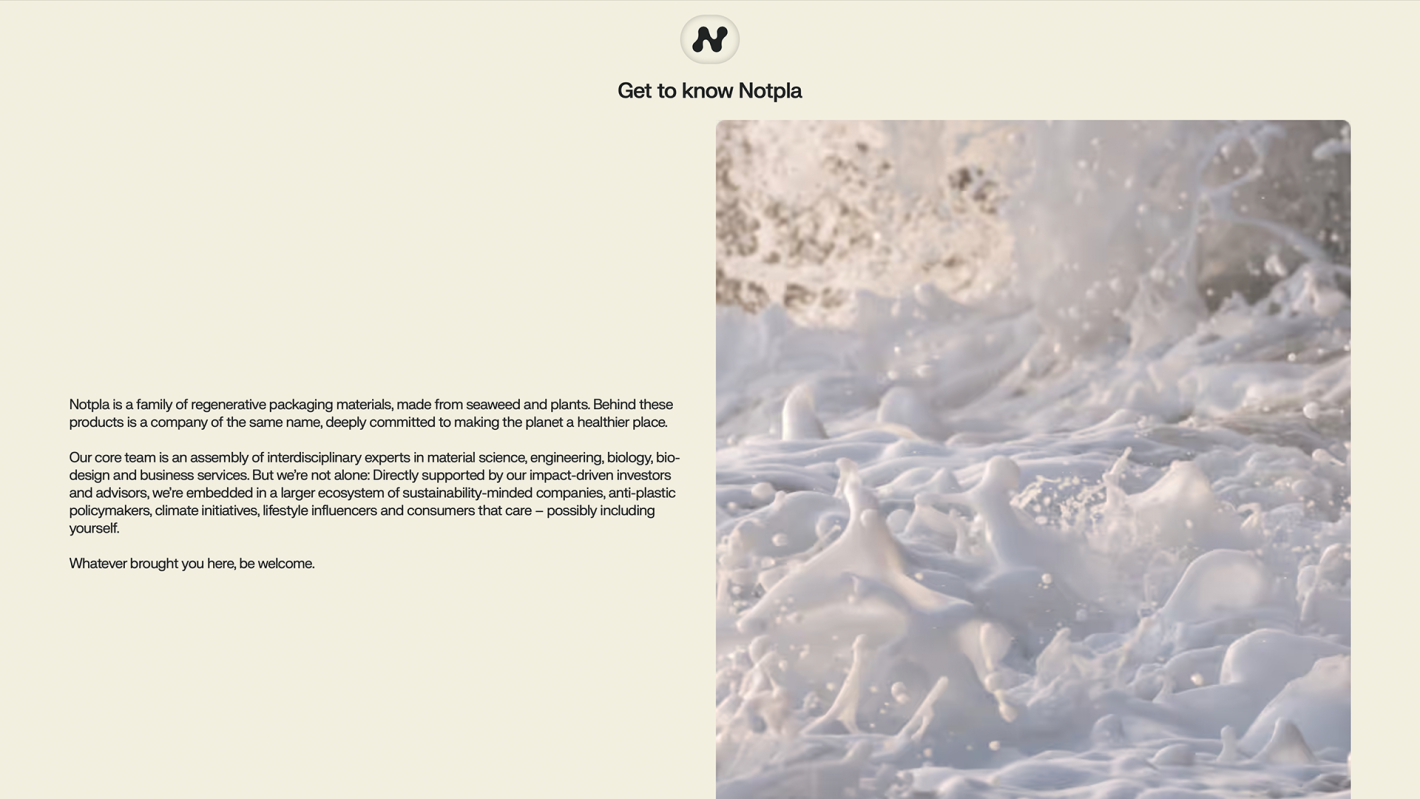
10. Notpla (Sustainable Packaging Startup)
Why it stands out: Earthy textures, parallax storytelling, and subtle interactive details mirror their innovative bio-packaging products. The site is clean and purpose-led, without losing its creative edge.
Creative elements: Immersive storytelling, brand-personality design
Accessibility notes: Layout hierarchy and text legibility are strong across devices.