Brochure Design Trends for 2024: How to Make Your Print Materials Stand Out
In the digital age, print materials like brochures remain a powerful tool for brands seeking to make a lasting impact. The tactile experience, the vibrant colours, and the way well-designed brochures can captivate attention make them an invaluable asset for marketing. But how do you ensure your brochures stand out in 2024? The answer lies in embracing emerging design trends that combine creativity with purpose. Here's a look at the top brochure design trends for 2024 that will help elevate your printed materials, ensuring they are both visually appealing and highly effective.
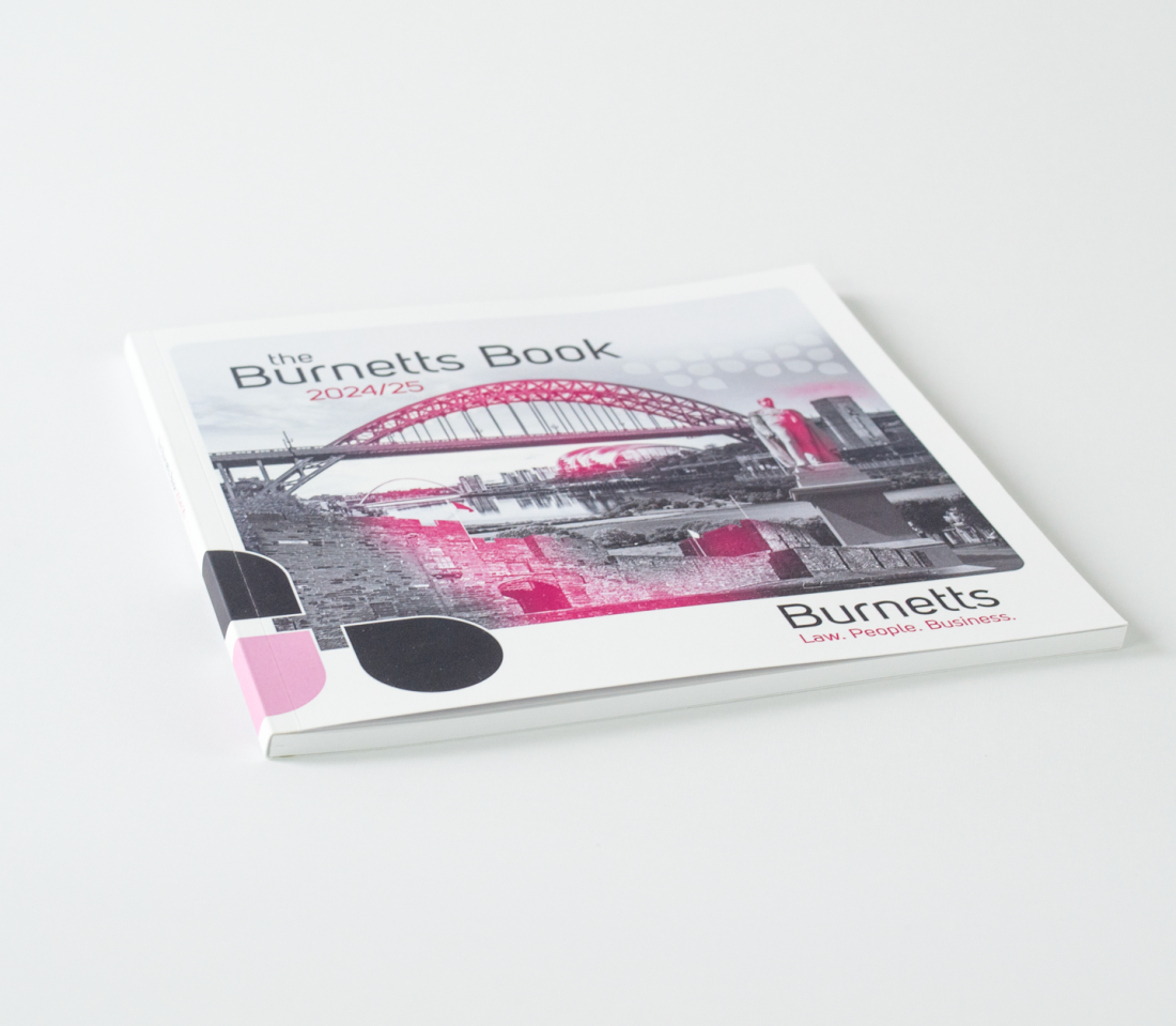
In 2024, brochure design is all about blending creativity with a strategic approach to captivate and convert your audience. One of the key trends to watch is minimalism with bold typography. Clean, open spaces paired with oversized, attention-grabbing fonts allow for a clear, impactful message that grabs attention without overwhelming the reader. This design philosophy embraces simplicity but adds bold touches, such as vibrant colour pops or metallic accents, to create a sleek, modern look.
Another prominent trend is the move toward asymmetrical layouts and layering. Traditional grid-based designs are being replaced by more fluid, asymmetrical layouts that add energy and movement to the design. By guiding the reader’s eye in unexpected directions, this approach allows for more creativity and a modern feel. Combine it with layered visuals—overlapping images, text, and textures—to add depth and dimension, pulling the reader deeper into your content.
Design in 2024 also welcomes a revival of vivid gradients. High-contrast colour transitions are becoming a favourite tool to convey a sense of movement and innovation. Gradients are no longer just a background feature; they’re being used within typography and illustrations to inject energy and vibrancy into brochures. This trend is perfect for brands looking to stand out with a bold, modern aesthetic.
Lastly, the use of custom illustrations and hand-drawn elements brings a personalised, authentic touch to brochure design. As digital perfection becomes the norm, bespoke designs and playful graphics help create an emotional connection, making your brochure feel more personal and engaging.
Paper Stock
The feel of a brochure is just as important as its visual appeal, and that’s where paper stock choices come into play. For 2024, businesses are increasingly focusing on the tactile experience that different types of paper provide. Choosing the right paper stock not only reinforces your brand's identity but also creates a memorable experience for the audience.
Satin paper stock offers a smooth, sophisticated texture with a soft sheen that feels luxurious without being overly shiny. It’s perfect for brochures that need a polished yet understated look. Gloss paper, on the other hand, is designed to make colours pop, enhancing the vibrancy of images and graphics, which is ideal for visually rich brochures. If you’re looking for something more natural, uncoated stock provides an organic, tactile feel, giving brochures a more artistic or rustic edge.
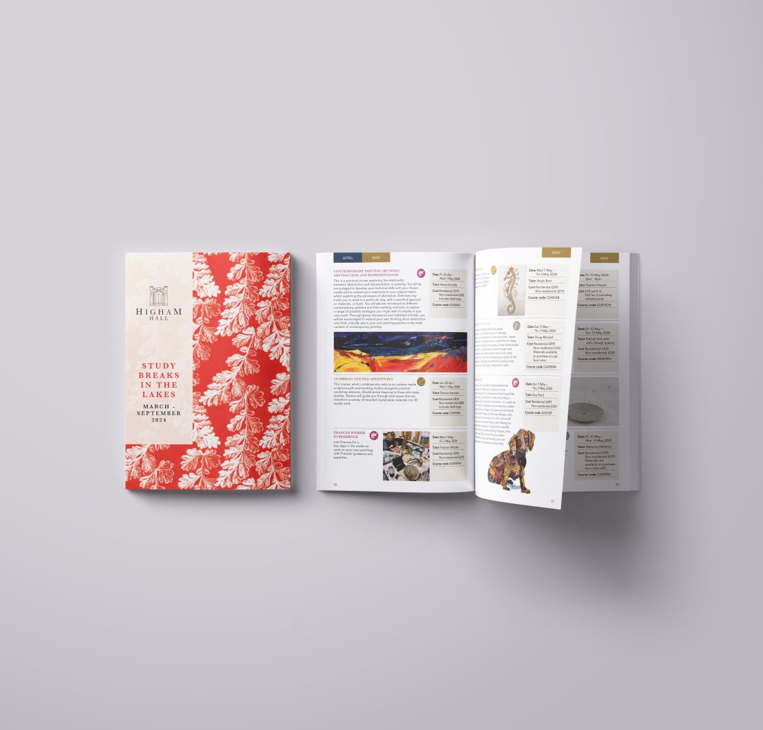
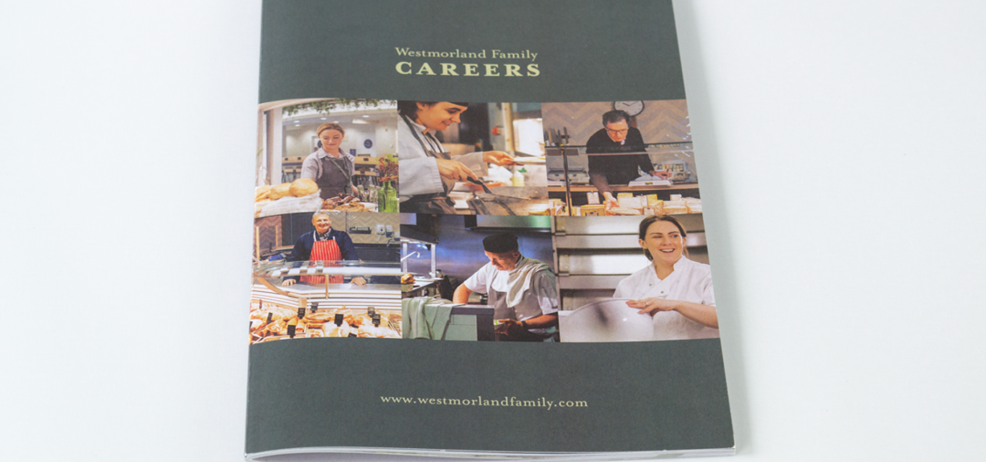
A well-designed brochure often requires a mix of paper types to make the most of its impact. Typically, cover stock is heavier and sturdier than the paper used for the inner pages, giving the brochure a durable, high-quality feel from the very first touch. Covers printed on a heavier, textured stock, paired with smoother, lighter paper for the inner pages, create a tactile contrast that enhances the overall presentation. This combination not only adds variety to the feel of the brochure but also allows for creative experimentation with finishes and effects on the cover.
Ready to make your brochures stand out in 2024?
Explore our professional brochure design services and transform your ideas into eye-catching, high-impact print materials. With both digital and litho printing options available, we’ll ensure your brochures are crafted with precision, using the latest design trends to engage and captivate your audience.
Print Finishes
The right print finish can transform an ordinary brochure into something truly memorable. In 2024, the focus is on creating tactile, sensory experiences that invite interaction and enhance the perceived value of your brochure.
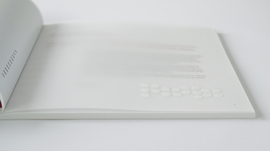
Spot UV is a popular technique that applies a glossy varnish to specific areas of the brochure, like logos, headlines, or key images. The contrast between the matte and gloss sections creates a dynamic look that draws attention to important elements. For those looking to exude elegance, matt laminates provide a smooth, non-reflective finish that adds a refined, premium touch.
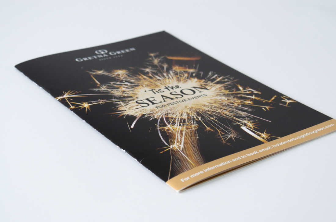
For a more luxurious effect, hot foiling is an excellent option. This process involves applying a metallic foil (typically gold, silver, or copper) to the brochure’s surface, creating a striking, high-end finish that instantly catches the eye. If you want to make certain colours or branding elements stand out, spot colours are ideal. This technique allows for the precise application of a specific colour, ensuring brand consistency and vibrant, standout hues that digital printing may struggle to match.
Each of these finishing techniques adds not just visual appeal but also a tactile dimension that invites the reader to engage more closely with the brochure, turning it from a simple marketing tool into a multisensory experience.
Sustainability and Eco-Friendly Design and Print Options
Sustainability is becoming a cornerstone of brochure design and print production in 2024. Brands and consumers alike are looking for eco-friendly options, and brochures are evolving to meet this demand. Choosing recycled paper is one of the most straightforward ways to reduce the environmental impact of your print materials. Recycled stock not only minimizes waste but also sends a positive message to your audience about your brand’s commitment to sustainability.
Another trend is the use of biodegradable inks, which are made from natural, plant-based materials rather than traditional petroleum-based inks. These inks are non-toxic and break down more easily, making them a great choice for environmentally conscious printing.
In addition to eco-friendly materials, earthy tones and natural textures are becoming popular in brochure design. These design choices reflect a brand’s sustainability values and appeal to eco-conscious consumers. By incorporating green practices and using sustainably sourced materials, you can create brochures that not only look great but also align with your brand’s environmental commitments.
Moreover, communicating your sustainability efforts can be a unique selling point. Simple elements like icons or callouts highlighting the use of recycled paper or biodegradable ink can make your audience feel good about engaging with your brand, reinforcing positive perceptions and driving deeper connections.